
You are here: Start » HMI » Standard HMI Controls
Standard HMI Controls
Introduction
There are several groups of UI components in the HMI Controls catalog:
- Components – with non-visual elements which extend the HMI window functionality.
- Containers – for organizing the layout with panels, groups, splitters and tab controls.
- Controls – with standard controls for setting parameters and controlling the application state.
- File System – for choosing files and directories.
- Indicators – for displaying inspection results or status.
- Logic and Automation – for binding some HMI properties with each other, also with basic AND/OR conditions.
- Multiple Pages – for creating multi-screen applications.
- Password Protection – for limiting access to some parts of an HMI to authorized personnel.
- Shape Editors – with controls that allow the end user to define object models or measurement primitives.
- Shape Array Editors – with controls that allow the end user to define an array of object models or measurement primitives.
- State Management – for loading and saving state of the controls to a file.
- Video Box ‐ with several variants of the VideoBox control for high-performance image display.
In a basic machine vision application you will need one VideoBox control for displaying an image, possibly with some graphical overlays, and a couple of TrackBars, CheckBoxes, TextBoxes etc. for setting parameters. You will also often use Panels, GroupBoxes, Labels and ImageBoxes to organize and decorate the window space.
Common Properties
Many properties are the same for different standard controls. Here is a summary of the most important ones:
- AutoSize – specifies whether a control will automatically size itself to fit its contents.
- BackColor – the background color of the component.
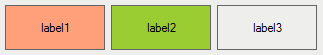
Three sample labels with different background colors.
- BackgroundImage – the background image used for the control.
- BorderStyle – controls how the border of the control looks like.
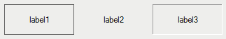
Three sample labels with different border styles.
- Enabled – can be used to make the control not editable by the end user.
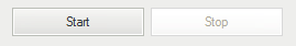
Sample buttons, first enabled, second disabled.
- Font – defines the size and style of the font used to display text in the control.
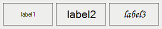
Three sample labels with different fonts.
- ForeColor – foreground color of the control, which is used to display text.
- Text – a string being displayed in the control.
- Visible – can be used to make the control invisible (hide it).
With the available properties it is possible to create an application with virtually any look and feel. For example, to use an arbitrary design for a button, we can use a bitmap, while setting FlatAppearance.BorderSize = 0 and FlatStyle = Flat:
Sample custom style for a button and a label.
Note: Most properties of HMI controls can be also set dynamically during program execution, although only some of them are visible as ports when the control is selected. To expose additional ports, use the "Edit Port Visibility..." command from the control's context menu.
HMI Canvas
HMICanvas control represents the entire window of the created application. Other controls will be placed on it. Properties of HMICanvas define some global settings of the application, which are effective when it is run with Adaptive Vision Executor (runtime environment):
- ConsoleEnabled – specifies whether diagnostic console can be shown in the runtime application.
- PreventWindowClose – enables preventing the user from closing the Adaptive Vision Executor window when the program is running.
- ProgramControllerVisible – specifies whether Start / Pause / Stop buttons will be visible on the toolbar of Adaptive Vision Executor.
- ToolbarVisible – specifies whether the toolbar of Adaptive Vision Executor will be visible.
- WindowIcon – Icon of the Adaptive Vision Executor window.
- WindowMode – specifies whether the application should be run in a fixed-size window, in a variable-size window or full-screen.
- WindowTitle – specifies the text displayed as the title of the runtime application.
Elements of the runtime application affected with properties of HMICanvas.
Remarks:
- If you are having trouble selecting the HMI Canvas because it is completely filled with other controls, right click on any control and choose the "Select: HMICanvas" command.
- Some parameters of HMI Canvas are automatically inherited by the contained controls. For example, if one changes the Font property, other controls will automatically have it set to the same value.
- Full-screen mode is especially useful, when it is required that the end user does not have access to elements of the underlying operating system. On Windows systems it is also possible to set Adaptive Vision Executor as the "system shell", thus removing Desktop, Menu Start etc. completely.
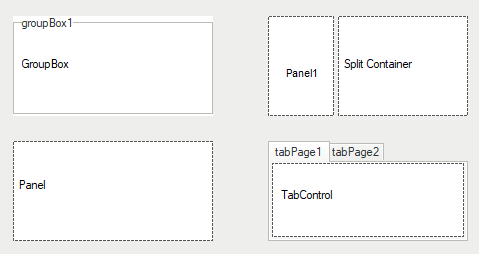
Controls for Setting Layout of the Window
Although it is possible to put all individual controls directly onto an HMI Canvas, it is recommended that related items are grouped together for both more convenient editing as well as for better end user's experience. Available controls in the "Containers" section are:
- GroupBox – can be used to group several controls within an enclosing frame with label.
- Panel – can be used to group several controls without additional graphical elements.
- SplitContainer – can be used to create two panels with movable boundary between them.
- TabControl – can be used to create multiple tabs in the user interface.
BackColor was changed from default to white in all containers.
To use any container drag it from the HMI Controls and drop it on the HMICanvas. Then put onto it all the controls you want to group together. Other method in order to do that is clicking on a desired container in "Containers" section and then selecting the area on HMI panel.
Other controls commonly used for making HMI look nice are: ImageBox (for displaying static images such as company logos) and Label (for any textual items).
However, when you would like to create more sophisticated HMI Panel with multiple screens, go to The Multi Panel Control
See also: The TabControl Control.
Controls for Displaying Images
The "Video Box" section of the HMI Controls window contains several controls for high-performance display of image streams. These are:
- VideoBox – the basic variant of the image display control.
- SelectingVideoBox – also allows for selecting a box region by the end user.
- ZoomingVideoBox – also allows for zooming and panning the image by the end user.
- FloatingVideoWindow – a component that allows for opening an additional window for displaying images.
A VideoBox.
To display some additional information over images in a VideoBox it is necessary to modify the images using drawing filters before passing them to the VideoBox. This gives the user full control over the overlay design, but may expand the program. To keep the program simple, while still being able to display some overlay information, it is possible to use View2DBox controls, which can be found in the "Indicators" section. They accept images and 2D primitives produced by various filters as input, however, the possibility of changing their style is limited:
- View2DBox – allows for overlaying 2D primitives (Point 2D, Circle 2D, Rectangle 2D etc.) over an image.
- View2DBox_PassFail – the color of the overlaying 2D primitives may change depending on the Status inputs.
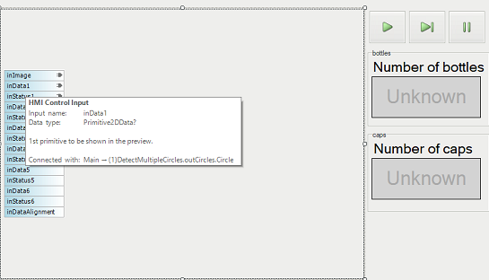
HmiView2DBox_PassFail used in bottle crate example.
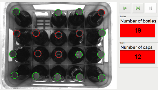
Executed bottle crate example program.
ImageBox from "Controls" section can be used to improve look of HMI for displaying static images such as company logos.
Notes:
- Do NOT use ImageBox control for displaying inspection results. Due to performance reasons, it should only be used for static images.
- In case that View2DBox receives the Nil value as an input, the preview does not refresh itself. As a result the old image is being kept in the preview instead of an empty one.
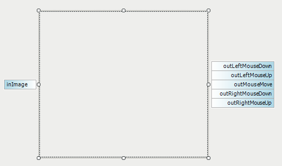
- The VideoBox controls provide mouse events, but ZoomingVideoBox and SelectingVideoBox make most of these events inactive when manual image manipulation is enabled. Only the Click event is always available.
Common properties:
- DisplayMode – switches between GDI and DirectX implementations. It depends on the underlying hardware, which one is faster.
- SizeMode – specifies how the image should be fitted to the available window space.
Controls for Setting Parameters
When some parameters of the application are to be set by the end user, the following controls can be used:
- TrackBar, Knob, NumericUpDown – for setting numerical values. You can set Minimum and Maximum parameters and then the value entered by the end user will be available on the outValue output.
- CheckBox, ToggleButton, OnOffButton, RadioButton – for turning something on or off. The outValue or outChecked output will provide the state of the setting.
- ComboBox, EnumBox – for choosing one of several options.
- TextBox – for entering textual data. The entered text will be available on the outText output.
Example: Using TrackBar
TrackBar by default has two connectable inputs and one connectable output. The inValue input and the outValue output represent the same property – the value indicated by the current state of the control. The second input, inEnabled, is a boolean value and controls whether the TrackBar is enabled or disabled in the user interface.
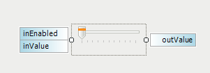
A track-bar.
Binding with a Label
Very often it is required that the current value of a TrackBar or a similar control is also visible in the HMI. This can be done with an additional Label control placed near the TrackBar, with the AutoValueSource property referring to the selected TrackBar.
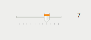
Label showing an exact value of the TrackBar.
It is also possible to specify the format of the displayed text. The picture below shows a connected Label with the AutoValueFormat property set to "Tolerance: % [px]".
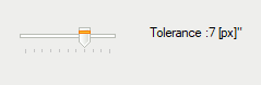
TrackBar with a connected Label using an additional text formatting.
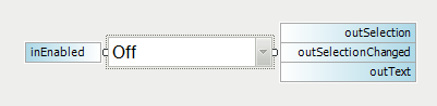
Example: Using ComboBox
ComboBox by default has one connectable input and two connectable outputs. To enable more ports e.g. a list of items to be displayed in ComboBox, right-click on it and select the Edit Ports Visibility.... You can connect an array of String values describing the names of items to inList input or simply add the items in the Properties window.
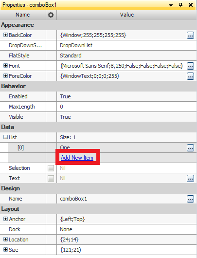
Click Add New Item to increase list.
By specifying the index in Selection parameter, the user defines initial selection which is chosen when the program is executed. Without this selection, the output will be Nil.
The outSelection output is of an Integer data type and returns the index of the selected item. The outText output is of a String data type and returns text associated with the selection.
Using EnumBox
EnumBox is very similar to ComboBox. The main difference between them is that the latter allows creating your own list of items while EnumBox can display one of the Enum types available in Adaptive Vision Studio e.g. ColorPalette, OCRModelType or RotationDirection.
Change Events
Controls that output a value adjustable by the user often also provide outputs informing about the moments when this value has been changed - so-called events. For example, the ComboBox control has an output named outSelection for indicating the index of the currently selected list item, but it also has outSelectionChanged output which is set to True for exactly one iteration when the selection has been changed.
Please note that most of the event triggering outputs e.g. outValueChanged, outSelectionChanged etc. are hidden by default and can be shown with the "Edit Port Visibility..." command in the context menu of the control.
See also: Handling HMI Events.
Controls for Displaying Inspection Results
Non-graphical inspection results are most often presented with the following controls:
- Label – for displaying simple text results.
- ListView, DetailedListView – for displaying arrays or tables.
- PassFailIndicator – for displaying text on a colorful background depending on the inspection status.
- BoolIndicatorBoard – for displaying inspection status where multiple objects or features are checked.
- AnalogIndicator, AnalogIndicatorWithScales – for displaying numerical results in a nice-looking graphical way.
Example use of one PassFailIndicator and several BoolIndicatorBoards.
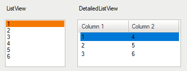
ListView and DetailedListView.
See also: Example with DetailedListView.
AnalogIndicator
AnalogIndicator and its variant AnalogIndicatorWithScales are used to display numerical results in a retro style – as analog gauges. The latter variant has green-orange-red ranges defined with properties like GreenColorMinimum, GreenColorMaximum etc. The ranges are usually disjoint, but there can also be nested ranges: e.g. the red color can span throughout the scale, and the green color can have a narrower range around the middle of the scale. The green sector will be displayed on top, producing an effect of a single green sector, with two red sectors outside.
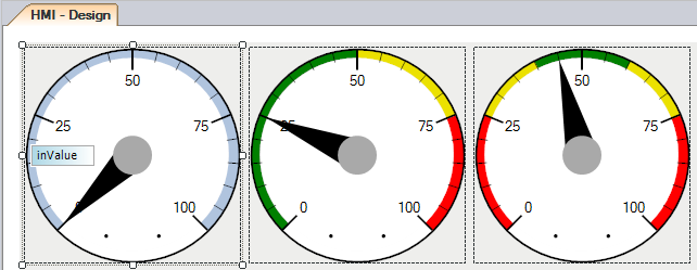
Analog indicators with and without scales
Event Triggering Controls
Most of the standard controls in Adaptive Vision Studio fall into one of two categories: (1) data presenters and (2) parameter setters. There are, however, also some controls that can trigger events – most notably the ImpulseButton control.
The ImpulseButton control is an event triggering control, which has one output, outValue. The value returned is of the Bool type. As long the button is not clicked, it will return False. Once the button is clicked, the value becomes True for exactly one iteration of the program.
A simple use case of the ImpulseButton.
For more information about events see: Handling HMI Events.
The TabControl Control
TabControl is the one of the methods to organize HMI panels within a limited space of a form. It is a container with several "tabs", where each page contains a different set of controls.
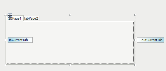
TabControl.
The MultiPanelControl Control
MultiPanelControl is an easy and convenient way to organize bigger HMI panels. It employs a multi-screen approach to provide more space and enables adding special purpose windows like e.g. a "Configuration" page.
MultiPanelControl.
To create a multi-screen HMI, put a MultiPanelControl control in your window and fit it to the window size.
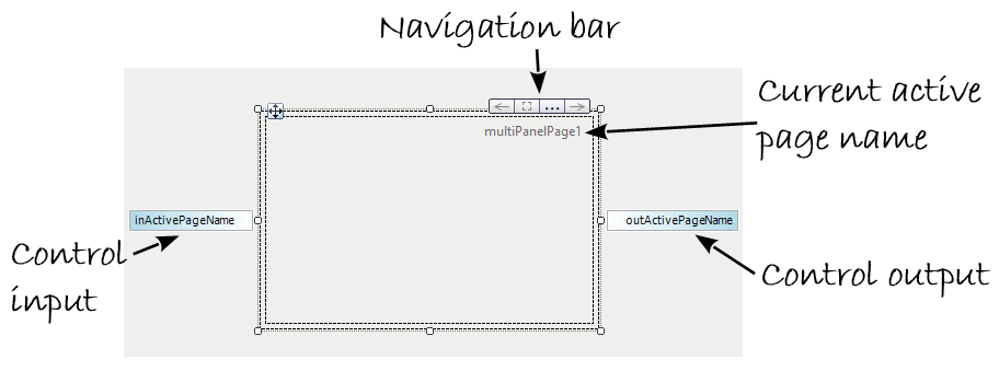
In the upper-right corner of this control, you will see a four-element Navigation Bar
( ).
Using the left and right arrows you will be able to switch between consecutive screens. The frame button allows
for selecting the parent control in the same way as the "Select: MultiPanelControl" command in the control's context menu.
The triple-dot button opens a configuration window as on the picture below:
).
Using the left and right arrows you will be able to switch between consecutive screens. The frame button allows
for selecting the parent control in the same way as the "Select: MultiPanelControl" command in the control's context menu.
The triple-dot button opens a configuration window as on the picture below:
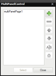
MultiPanelControl Property Box.
Also when you double-click on the area of a MultiPanelControl, the same configuration window appears. Using this window you are able to organize the pages. During work with pages there are at least two necessary things you have to remember. First – all pages names have to be unique globally. Second – one MultiPanelControl contains many MultiPanelPages. An important thing is the home icon – use it to set the Initial Page of your application. It will be the first page to appear when the program starts.A MultiPanelControl control is usually accompanied by some MultiPanelSwitchButton controls that navigate between the pages. Usage of a button of this kind is very simple. Just place it on your window and set the TargetPage property (also available through double-clicking on the button). Page switching buttons are usually placed within individual pages, but this is not strictly required – they can also be placed outside of the MultiPanelControl control.
Every HMI Control has built-in input and output ports. In MultiPanelControl, by default, two ports are visible: "inActivePageName" and "outActivePageName", but others are hidden. To make them visible click the right mouse button on the control and select Edit Ports Visibility.... The "inActivePageName" input enables setting the active page directly from your program. It is another way to handle page changing. One is using the dedicated buttons by the operator and here comes another method. It might be useful e.g. when "something happens" and you would like to change the screen automatically, not by a button click. This can be e.g. information that a connection with remote host was lost and immediate reconfiguration is needed. The "outActivePageName" by definition is the output which allows you to check the current active page.
Note: There is a tutorial example HMI Multipanel Control.
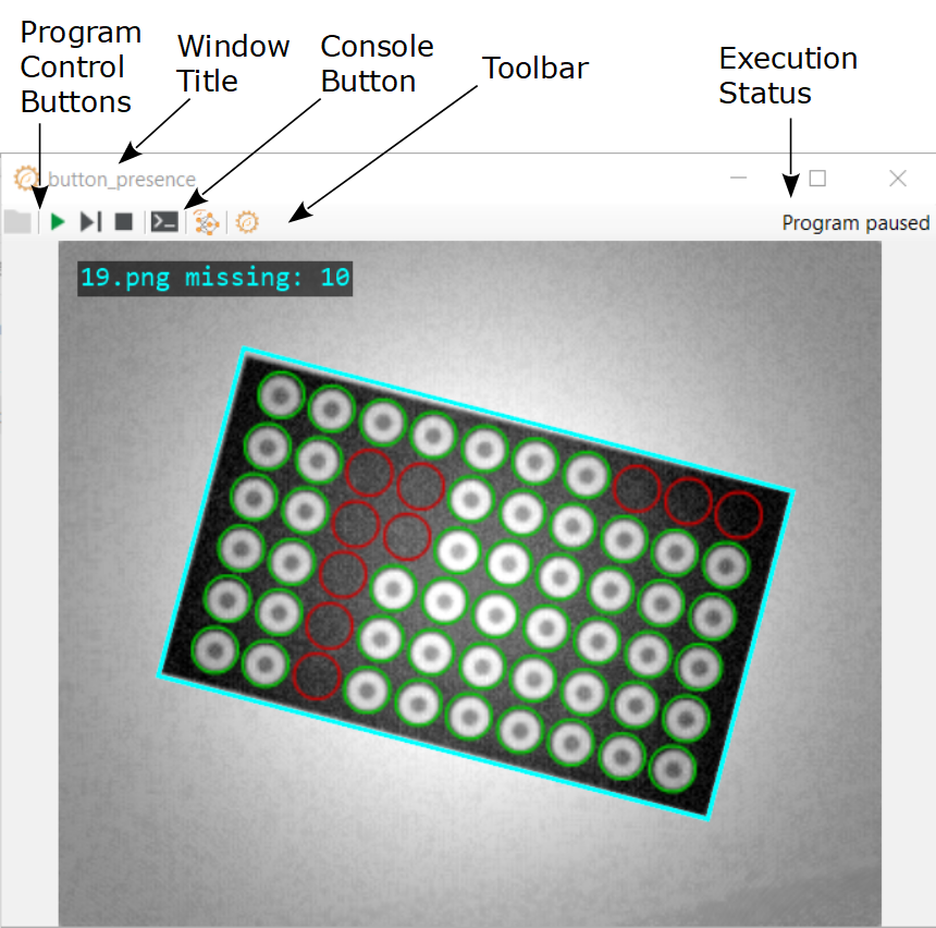
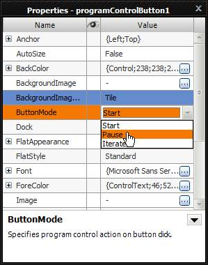
Program Control Buttons
Controlling the program execution process, i.e. starting, iterating and pausing, by the end user is possible with a set of ProgramControlButton controls, or with the complete panel named ProgramControlBox. These controls are available in the "Controls" section of the HMI Controls window.
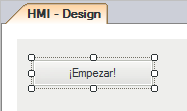
A Start button with a custom text.
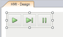
ProgramControlBox, similar to the controls from Adaptive Vision Studio.
Remarks:
- The Stop button is not available for the HMI, because the end user should not be able to stop the entire application at a random point of execution. If you have a good reason to make it possible, use a separate ImpulseButton control connected to an Exit filter.
- ProgramControlButton and ProgramControlBox controls are useful for the purpose of fast prototyping. In many applications, however, it might be advisable to design an application-specific state machine.
File and Directory Picking
There are two controls for selecting paths in the file system, which are FilePicker and DirectoryPicker. They look similar to a TextBox, but they have a button next to them, which brings up a standard system file dialog for browsing a file or directory.
What is worth mentioning about these two controls is the option NilOnEmpty, which can be useful for conditional execution. As the name suggests, it causes the control to return the special NIL value instead of an empty string, when no file or directory is chosen.
Shape Editors
Geometrical primitives, regions and fitting fields, that are used as parameters in image analysis algorithms, are usually created by the user of Adaptive Vision Studio. In some cases, however, it is also required that the end user is able to adjust these elements in the runtime environment. For that purpose, in the "Shape Editors" section there are appropriate controls that bring graphical editors known from Adaptive Vision Studio to the runtime environment.
Note: Shape Array Editor controls allow to create multiple primitives of the same data type and return the array of primitives e.g. Segment2DArray, Circle2DArray etc.
Each such editor has a form of a button with four ports visible by default:
- inAlignment – for specifying an appropriate coordinate system for the edited shape.
- inReferenceImage – for specifying a background images for the editor.
- inValue – for setting initial value of the edited shape.
- outValue – for getting the value of the shape after it is edited by the end user.
- outStoredReferenceImage – a reference image that was displayed in the editor during last editing approved with the OK button. Active when inStoreReferenceImage is set to True.
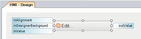
Sample ShapeRegion editor control in the HMI Designer.
When the end user clicks the button, an appropriate graphical editor is opened:
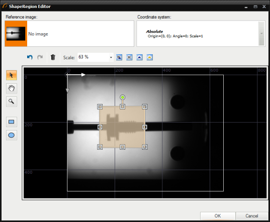
Sample ShapeRegion editor opened after the button is clicked in the runtime environment.
The following properties are specific for these controls allow for customizing appearance of an opened editor:
- HideSelectors – allows to simplify the editor by removing image and coordinate system selectors.
- Message – an additional text that can be displayed in an opened editor as a hint for the user.
- WindowTitle – text displayed on the title bar of the opened editor's window.
Shape editors can be used for creating input values for filter or modify existing values. Every shape editor has a proper data type assigned to inValue and outValue. The following list shows data types assigned to individual HMI controls and example filters that can be connected with them.
- Arc2DEditor - Arc2D - CreateArc
- ArcFittingFieldEditor - ArcFittingField - FitArcToEdges
- BoxEditor - Box - CreateBox
- Circle2DEditor - Circle2D - CreateCircle
- CircleFittingFieldEditor - CircleFittingField - FitCircleToEdges
- Line2DEditor - Line2D - DrawLines_SingleColor
- LocationEditor - Location - LocationsToRegion
- PathEditor - Path - OpenPath
- PathFittingFieldEditor - PathFittingField - FitPathToEdges
- Point2DEditor - Point2D - AlignPoint
- Rectangle2DEditor - Rectangle - CreateRectangle
- Segment2DEditor - Segment2D - CreateSegment
- SegmentFittingFieldEditor - SegmentFittingField - FitSegmentToEdges
- ShapeRegionEditor - ShapeRegion - DrawShapeRegions_SingleColor
ProfileBox
ProfileBox is the HMI control that displays a profile of evenly sampled measurements. ProfileBox is available in the "Indicators" section of the HMI Controls window.
ProfileBox may be useful for displaying an array of samples of a known length, i.e. a profile of an image column or a laser line.
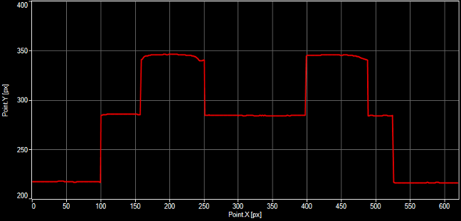
Profile of a laser line.
Also, it is used for displaying dynamic data from sensors in the function of time.
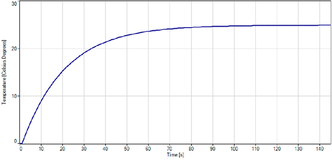
Temperature chart.
There are several properties specific to that control:
- DomainDefaultLength, DomainDefaultSizeMode, DomainScale and DomainStart – the set of parameters specifying the appearance and behavior of the X axis.
- EnableManualZoomChange – for specifying whether the end user is able to zoom the chart area.
- ChartColor, GridColor, BackColor, AxisColor – for specifying the colors of a ProfileBox content.
- HighQualityMode – for specifying whether the chart is drawn with high quality or with low quality, but faster.
- HorizontalAxisName, VerticalAxisName – for specifying the names of axes.
- HorizontalAxisMin, HorizontalAxisMax, VerticalAxisMin, VerticalAxisMax – for setting the limits of chart axes.
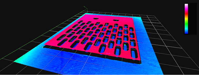
View3DBox
View3DBox is the HMI control that displays 3D primitives. It is available in the "Indicators" section of the HMI Controls window.
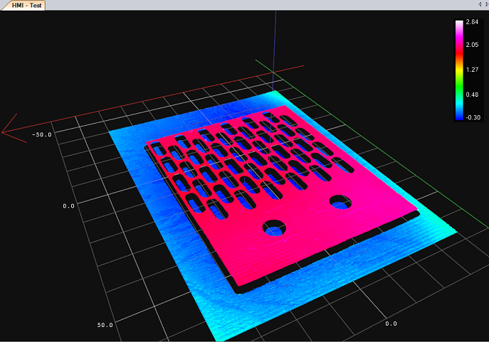
An example of using View3DBox control.
Default settings of that HMI control allow to connect four inData inputs. However, it is possible to use up to eight inputs. To make all inputs visible, right-click on the View3DBox, select Edit Ports Visibility... and select the inputs you want to use.
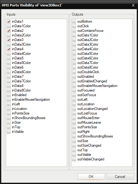
View3DBox ports visibility.
inData input accepts all 3D data types such as Point3D, Box3D, Circle3D, Plane3D, Segment3D, Line3D, Sphere3D and the data types for point cloud representation: Surface, Point3DGrid and Point3DArray.
The color of displayed primitives can be changed with inDataColor input.
There are also other properties that can be used to customize a data preview:
- EnableAntiAliasing – when set to true increases the render quality at the expense of performance.
- GridMode – specifies visibility and orientation of the measurement grid displayed in the scene.
- PointSize – specifies the display size of the cloud points relative to the size of the scene.
- ProjectionMode – selects the view/projection mode of 3D visualization.
- ScaleColoringMode – allows to enable automatic coloring of the cloud points according to the position along the specified axis.
- ShowBoundingBoxes – enables displaying range of bounding boxes around point cloud primitives in the preview.
- WorldOrientation – the type and orientation of a coordinate system used to display 3D primitives.
Interaction between the user and his program can be adjusted with parameters in Behaviour section. To customize this interaction the following parameters should be changed:
- Enabled – indicates whether the control is enabled.
- EnableMouseNavigation – when set to true enables the user to change observer position using mouse.
- InitialViewState – specifies the initial position of observer in the scene.
- Visible – determines whether the control is visible or hidden.
Commonly used features of View3DBox control
To make point cloud differences along Z axis more visible, change the ScaleColoringMode form Solid to ZAxis.
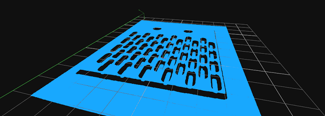
View3DBox with ScaleColoringMode set to Solid.
View3DBox with ScaleColoringMode set to ZAxis.
Point3DArray displaying
Point3DArray containing up to 300 points is displayed as an array of 3D marks (crosses). If there are more than 300 points, they are displayed as a standard point cloud.
ActivityIndicator
ActivityIndicator is used to visualize a working or waiting state of User Interface. There are two appearance modes available: "Busy" and "Recording". Both are shown in the below picture. By setting its input inActive to True or False values, user can display the animation showing that the program is either calculating or recording something.
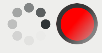
Busy and Recording mode of ActivityIndicator.
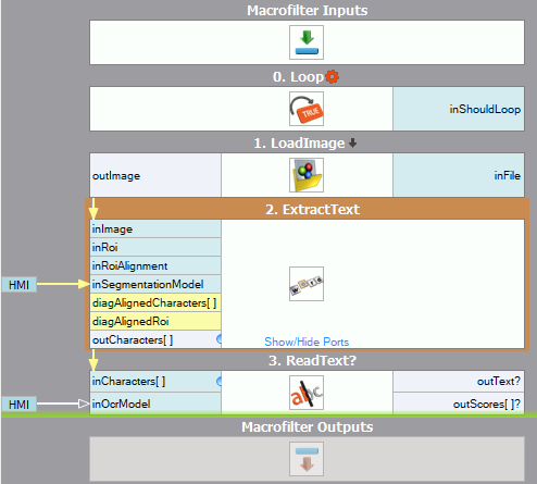
TextSegmentationEditor and OcrModelEditor
TextSegmentationEditor and OcrModelEditor HMI controls allow the user to edit a SegmentationModel and OCRModel respectively in a runtime environment. They allow to create an application which can be re-trained when new fonts are required to be read or when characters change their shape over time.
The concept of OCR and OCR tools available in Adaptive Vision Studio software are described in the following articles:
- Machine Vision Guide: Optical Character Recognition,
- Creating Text Segmentation Models,
- Creating Text Recognition Models.
TextSegmentationEditor
Once a TextSegmentationEditor is added, the following ports are visible:
- inReferenceImage – an image set as the editor background.
- inRoi – a region of interest for the reference image.
- inRoiAlignment – an alignment for the region of interest. Its purpose is to adjust the ROI to the position of the inspected object.
- outStoredReferenceImage – the image set as the editor background that can be sent to the algorithm.
- outValue – a segmentation model. This value can be connected to inSegmentationModel input of the ExtractText filter.
- outValueChanged – an output of the bool data type that is set to True for one iteration in which the outValue is changed.
After clicking on TextSegmentationEditor button, the editor will be opened. However, to be able to open it, the program has to be executed.
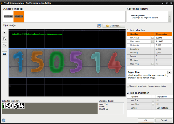
Editor is the same as inSegmentationModel editor known from ExtractText filter.
OCRModelEditor
Once an OCRModelEditor is added, the following ports are visible:
- inReferenceCharacters – is a value of RegionArray data type. Characters from ExtractText filter can be connected to that input. The characters will be used during a model training.
- inReferenceImage – an image set as the editor background.
- outStoredReferenceImage – the image set as the editor background that can be sent to the algorithm.
- outValue – is a result OcrModel. This value should be connected to inOcrModel input in ReadText filter.
- outValueChanged – an output of the bool data type that is set to True for one iteration in which the outValue is changed.
After clicking on OCRModelEditor button, the editor will be opened. However, to be able to open it, the program has to be executed.
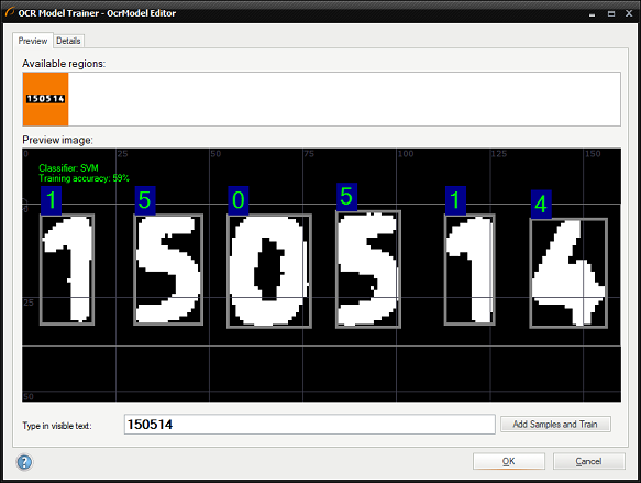
Editor is the same as inOcrModel editor known from ReadText filter.
A simple program which is using TextSegmentationEditor and ocrModelEditor.
KeyboardListener
KeyboardListener is used for getting information about keyboard events. This HMI control returns an IntegerArray where each value describes a number represented in the ASCII code.
To use KeyboardListener or any other tools from the "Components" category, a control must be dropped at any place on the HMICanvas.
All default output values allow to check which key is pressed, but there is a few differences between them:
- outKeysDown – emits array of keys that have been recently pressed.
- outKeysPressed – emits array of currently pressed keys. Using this output is recommended is most cases.
- outKeysUP – emits array of keys that have been recently released.
To use those values in other place in program the best solution is copying them with CopyObject filter with IntegerArray data type.
VirtualKeyboard
VirtualKeyboard is the HMI control which enables showing of automatic on-screen virtual keyboard for editing content of HMI controls.
This functionality can be used in a runtime environment when a physical keyboard is not available at the workstation.
To use VirtualKeyboard or any other tools from the "Components" category, a control must be dropped at any place on the HMICanvas.
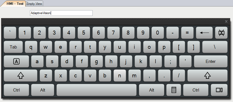
The example of using VirtualKeyboard for entering data on HMI panel into TextBox control.
User can set the initial preset size of keyboard window by setting proper InitialKeyboardSize value in the properties.
It is possible to display only a number pad keyboard for editing numerical values. To do that, EnableNumPadOnlyKeyboard must be set to True in the properties.
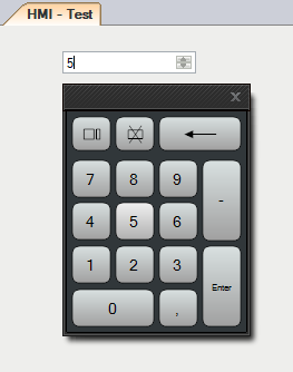
The example of using VirtualKeyboard for entering data on HMI panel into NumericUpDown control.
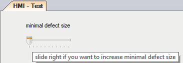
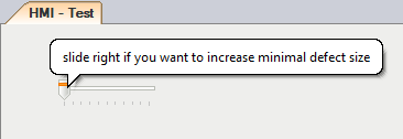
ToolTip
ToolTip HMI control is used to display messages created by the user. Those messages are displayed when user moves the pointer over an associated control.
This functionality can be used when a developer wants to give helpful tips for a final user.
To use ToolTip or any other tools from the "Components" category, a control must be dropped at any place on the HMICanvas.
Once ToolTip control is added, each HMI Control has additional parameter available under the "Misc" category in the Properties window. It is possible to use multiple ToolTips with different parameters.
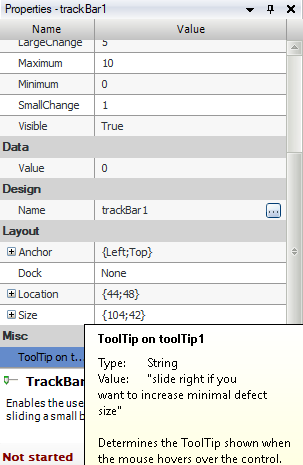
Editable ToolTip message in TrackBar HMI control properties.
ToolTip properties can be adjusted to user's requirements by changing the following values:
- Active – determines if the ToolTip is active. A tip will only appear if the ToolTip has been activated.
- AutomaticDelay – sets the values of AutoPopDelay, InitialDelay and ReshowDelay to the appropriate values.
- AutoPopDelay – determines the length of time the ToolTip window remains visible if the pointer is stationary inside a ToolTip region.
- BackColor – the background color of the ToolTip control.
- ForeColor – the foreground of the ToolTip control.
- InitialDelay – determines the length of time the pointer must remain stationary within a ToolTip region before the ToolTip window appears.
- IsBalloon – indicates whether the ToolTip will take on a balloon form.
- ReshowDelay – determines the length of time it takes for subsegment ToolTip windows to appear as the pointer moves from one ToolTip region to another.
- ToolTipTitle – determines the title of the ToolTip.
- UseAnimation – when set to true, animation are used when the ToolTip is shown or hidden.
- UseFading – when set to true, a fade effect is used when ToolTip are shown or hidden.
Displayed information which default ToolTip setting and which active balloon form.
ColorPicker
ColorPicker is a tool which allows the user to pick the color components in the runtime environment.
This control can be used i.e. when it is required to know the reference color used by an algorithm.
The outValue port contains the value of selected color and can be connected to all tools containing an input of the Pixel data type.
In a Color Picker window the user can use the palette of colors or enter the values of color components manually.
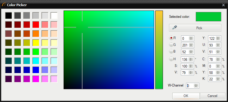
Color Picker window.
Logic and Automation tools
BoolAggregator
BoolAggregator allows to connect multiple boolean signal sources using logic functions for purpose of controls such as EnabledManager.
This function is useful when user wants to aggregate boolean signals from at least two HMI Controls e.g. OnOffButton or CheckBox without having to pass them through the program.
To use BoolAggregator or any other tools from the "Logic and Automation" category, a control must be dropped at any place on the HMICanvas.
While working with that control, user needs to select boolean value sources to be aggregated. It can be done in the Properties window. Also, additional two values from the program can be aggregated by connecting them to the inValue1 and inValue2 inputs.
Using BoolAggregator's properties it is also possible to negate the value from a data source by setting SourceNegate to True.
Mode property specifies the type of aggregation function to be used to connect multiple data sources. The following aggregation functions are available:
- And
- NotAnd
- Or
- NotOr
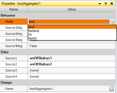
Bool Aggregator's properties.
EnabledManager
EnabledManager allows to automatically manage controls enable state using other HMI controls as a boolean value source.
This function is commonly used with BoolAggregator in order to manage controls' enable states in more complex cases.
To use EnabledManager or any other tools from the "Logic and Automation" category, a control must be dropped at any place on the HMICanvas.
Once the EnabledManager is added to the HMICanvas, it allows to send an enable signal to every HMI Control. User can specify the source of the enable signal by selecting it from the AutoEnabledSource list available in the Properties window. It is also possible to negate the source data value by setting the AutoEnabledNegate to true.
In the example below TextBox's enable state is controlled by BoolAggregator which gathers signals from two onOffButton HMI Controls.
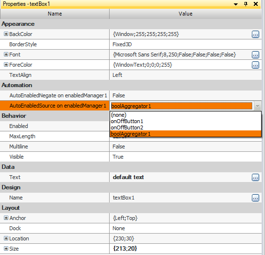
Automation category in TextBox's properties.
EdgeModelEditor
EdgeModelEditor is the HMI control that makes it possible to create a Template Matching model in runtime environment by using an easy user interface called "GUI for Template Matching".
The process of creating a model representing the expected object's shape is described in Creating Models for Template Matching article.
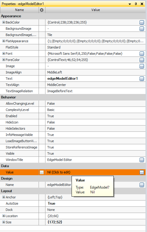
Once an EdgeModelEditor is added, the user can specify a reference image by connecting it to inReferenceImage input. The reference image can also be loaded from a file by clicking Load Image... button available in the EdgeModel Editor's toolbar.
outValue output has EdgeModel data type. This output can be connected to inEdgeModel input in LocateObjects_Edges filter.
Besides standard parameters available in the Appearance, Design and Layout sections of the Properties window, the EdgeModelEditor can be customized using the following parameters:
- AllowChangingLevel – allows to change plugin complexity level.
- ComplexityLevel – default plugin complexity level.
- Enabled – determines if the control is enabled.
- HideIcon – determines if the editor icon is hidden.
- HideSelectors – determines if the image and alignment selectors of EdgeModel Editor are hidden.
- InfoMessageVisible – determines if plugin's hint messages are displayed under the Reference image bar.
- LoadImageButtonVisible – determines if a reference image can be loaded from the disc by using "Load Image..." button available in the editor's toolbar.
- StoreReferenceImage – if set to True the selected reference image is available at the outStoredReferenceImage output.
- WindowTitle – text displayed on the editor window bar.
First method to edit EdgeModel.
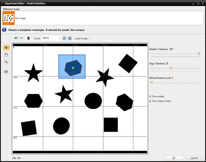
EdgeModelEditor window.
To use the model created by EdgeModelEditor, user needs to connect the outValue output to the inEdgeModel input of LocateSingleObject_Edges filter.
GrayModelEditor
GrayModelEditor is the HMI control that makes it possible to create a Template Matching model in runtime environment by using an easy user interface called "GUI for Template Matching".
The process of creating a model representing the expected object's shape is described in Creating Models for Template Matching article.
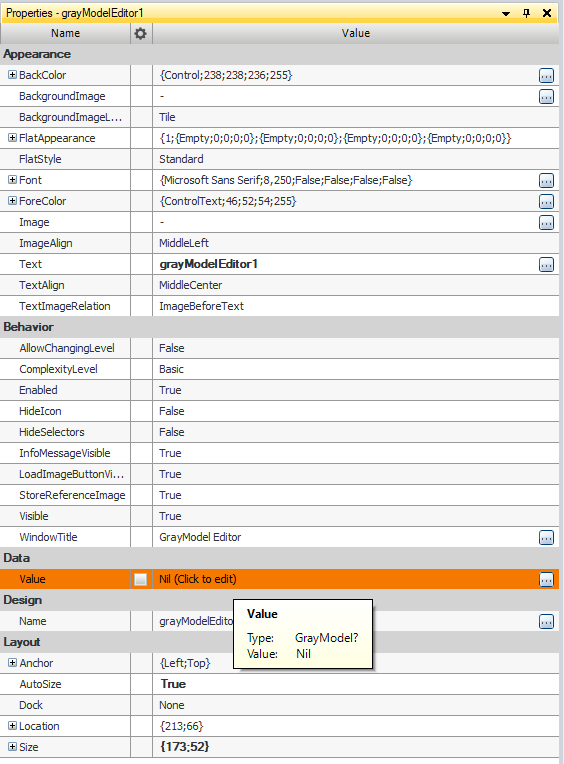
Once a GrayModelEditor is added, the user can specify a reference image by connecting it to inReferenceImage input. The reference image can also be loaded from a file by clicking Load Image... button available in the GrayModel Editor's toolbar.
Besides standard parameters available in the Appearance, Design and Layout sections of the Properties window, the GrayModelEditor can be customized using the following parameters:
- AllowChangingLevel – allows to change plugin complexity level.
- ComplexityLevel – default plugin complexity level.
- Enabled – determines if the control is enabled.
- HideIcon – determines if the editor icon is hidden.
- HideSelectors – determines if the image and alignment selectors of EdgeModel Editor are hidden.
- InfoMessageVisible – determines if plugin's hint messages are displayed under the Reference image bar.
- LoadImageButtonVisible – determines if a reference image can be loaded from the disc by using "Load Image..." button available in the editor's toolbar.
- StoreReferenceImage – if set to True the selected reference image is available at the outStoredReferenceImage output.
- WindowTitle – text displayed on the editor window bar.
To use the model created by GrayModelEditor, user needs to connect the outValue output to the inGrayModel input of LocateSingleObject_NCC filter.
First method to edit GrayModel.
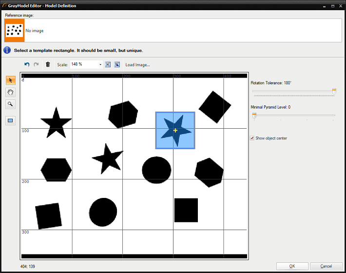
GrayModelEditor window.
GenICamAddressPicker
GenICamAddressPicker is used to choose GenICam GenTL device address in runtime environment. This control can be used with GenICam filters.
See also: examples where a GenICamAddressPicker control is used: HMI Grab Single Image and HMI Image Recorder.
GigEVisionAddressPicker
GigEVisionAddressPicker is used to choose GigE Vision device address in runtime environment. This control can be used with GigE Vision filters.
See also: an example where GigEVisionAddressPicker control is used: HMI Image Recorder.
MatrixEditor
MatrixEditor is used to modify existing Matrix or create a new one in runtime environment.
outValue returns matrix which was modified or created in MatrixEditor.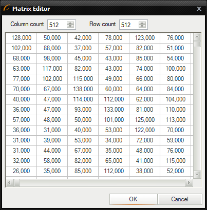
Matrix Editor window.
Deep Learning
Pressing the Deep Learning Start Button allows you to enter Deep Learning Editor from the level of the HMI.
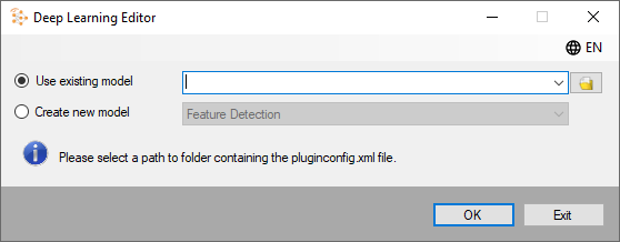
- ModelPath - path of a saved model. If empty or invalid the Model Path Selection dialog box will be opened.
- AlwaysOnTop - editor will always be visible as a top window.
- DisableChangingLocation - prevents the user from changing model path.
- Language - selects language of the editor.
| Previous: Designing HMI | Next: Handling HMI Events |