You are here: Start » Standard WebHMI Controls
Standard WebHMI Controls
- Introduction
- Common Properties
- Data Display
- Input
- Layout
Introduction
There are three WebHMI control groups that represent the contained control purpose:
- Data Display
- Input
- Layout
Common Properties
Several properties are common for all the controls. Some of them accept textual values even if they are related to the numeric ones. This is due to a lot of properties directly accepting the CSS (Cascading Style Sheets) syntax, e.g. the
Width property can be defined with apx ,em or% unit:100px . For more information see the CSS documentation.Property Description Width Sets the control width. Height Sets the control height. Margin Control Margin in the CSS shorthand syntax, e.g.: 10px 5px for left and right margins set to 10 px and top and bottom - 5 px.Name The name of the control which must be non-empty and unique for the whole page. Data Display
The controls designed for displaying various types of data. e.g. Image, text, etc.
PictureBox
Displays an Image object that can be passed through the
inSource input.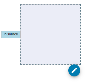
Property Description Source Image source which may either be connected to the filter output of type Image, or be set to url address of the static image. TextBlock
Displays either a dynamic or static text.
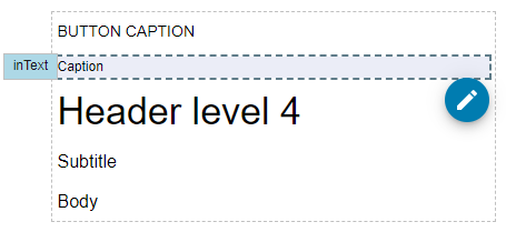
Property Description Text String that can either be calculated in the connected filter output or directly defined in the Properties Control. InitialText When the Text property is connected to the filter output, this property defines the displayed text until any data will be passed to the control. Typography The style of the displayed text. StatusIndicator
The visualization of the
Bool? data type.
Property Description Status Value of type Bool? . The value can be connected to the filter output.Svg
Displays basic shapes with the svg html element.
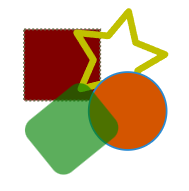
Property Description ViewBox Defines the path area within the data that will be displayed. In case of exported svg files, the original ViewBox can be found in the viewBox attribute of the root element. Any changes to the original ViewBox will result in cropped and translated shapes.Shapes within the Svg control are defined with child elements each of which may contain independent fill, stroke and transform.
Property Description Fill Color of the shape background. Stroke Color of the shape outline. StrokeWidth The thickness of the shape outline. StrokeDashArray A list of white space separated lengths of dashes and gaps used to paint the shape outline. StrokeLineCap Defines the shape that is used at the end of stroke open subpaths. StrokeLineJoin Defines the shape that is used at the corners of the stroke. Transform Defines the group of basic transformations applied to the shape. There are several shapes available for the Svg element: Rect, Circle, Ellipse, Path, Polyline and Polygon.
Rect
Draws a rectangle.
Property Description Height The height of the rectangle. Rx The horizontal corner radius of the rectangle. Ry The vertical corner radius of the rectangle. Width The width of the rectangle. X The x coordinate of the rectangle Y The y coordinate of the rectangle Circle
Draws a circle.
Property Description Cx The x coordinate of the circle center. Cy The y coordinate of the circle center. R The radius of the circle. Ellipse
Draws an ellipse.
Property Description Cx The x coordinate of the ellipse center. Cy The y coordinate of the ellipse center. Rx The radius of the ellipse on the x axis. Ry The radius of the ellipse on the y axis. Path
Generic element that can draw any shape.
Property Description Data Definition of the shape in form of the path commands. An easy way to obtain such commands is to export a shape, drawn in vector graphics application, e.g. Inkscape, to an optimized svg file. The commands can be found under the d attribute of thepath xml element.FillRule Algorithm that is used to determine the inside part of the shape. Polyline
Draws straight lines connecting given points.
Property Description Points List of the white space separated coordinate pairs in format x,y , e.g.0,0 10,10, 20,0 FillRule Algorithm that is used to determine the inside part of the shape. Polygon
Defines a closed shape.
Property Description Points List of the white space separated coordinate pairs in format x,y , e.g.0,0 10,10, 20,0 FillRule Algorithm that is used to determine the inside part of the shape. Input
Button

Property Description Text The button's caption. Click Event raised when the button is clicked. CheckBox
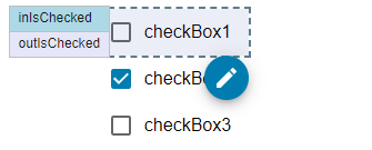
Property Description IsChecked Gets or sets the Boolean value.InitialIsChecked Gets or sets the initial Boolean value. Click Event raised when the CheckBox is clicked. Checked Event raised when the IsChecked property is set to true. Unchecked Event raised when the IsChecked property is set to false. Text The CheckBox's caption. ComboBox
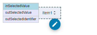
Property Description Items Items available in the dropdown. Each item is defined in separate line. SelectedValueChanged Event raised when the selected item is changed. SelectedValue Gets or sets the selected item index. SelectedIdentifier Gets the selected item text. InitialValue Sets the item index that is selected by default. RadioGroup
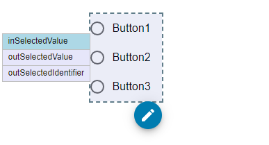
Property Description Items Items available in the dropdown. Each item is defined in separate line. SelectedValueChanged Event raised when the selected item is changed. SelectedValue Gets or sets the selected item index. SelectedIdentifier Gets the selected item text. InitialValue Sets the item index that is selected by default. Slider

Property Description Value Gets or sets the Real value.InitialValue Sets the initial value. Minimum Sets the minimal value the Value property can be set to. Maximum Sets the maximal value the Value property can be set to. Step Sets the distance between two discrete values. ValueChanged Event raised when the Value is changed. Switch

Property Description IsChecked Gets or sets the Boolean value.InitialIsChecked Gets or sets the initial Boolean value. Click Event raised when the CheckBox is clicked. Checked Event raised when the IsChecked property is set to true. Unchecked Event raised when the IsChecked property is set to false. Text The CheckBox's caption. TextBox
Control for defining textual data.
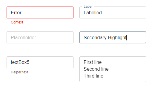
Property Description HelperText Hint about the value to provide. HighlightColor Color that is used for the border lines when the control contains focus. InitialReadonly When the Readonly property is connected to the filter output, this property defines the Readonly mode until any data is passed to the control. InitialText When the Text property is connected to the filter output, this property defines the displayed text until any data is passed to the control. IsValid Allows to mark the control as invalid. This value can be connected with filter instance output. Label Defines the text box label, that is displayed in the top left corner of the control. MaxRows Defines the maximum row count that is displayed when the control is in Multiline mode. MinRows Defines the minimum row count that is displayed when the control is in Multiline mode. Multiline Defines if the control can display multiple lines. Placeholder Defines the text box content, that is displayed when the control Text is empty. Readonly Sets if the control Text can be modified. This value can be connected with filter instance output. Rows Defines the displayed row count when the control is in Multiline mode. If unset or false, the control expands to display as many lines as possible. Text String that can either be calculated in the connected filter output, be directly defined in the Properties Control or typed in by the user during runtime. TextChanged Event raised when the Text property is changed. Variant Defines the control decoration. NumericUpDown

Property Description Value Gets or sets the Integer value.InitialValue Sets the initial value. Minimum Sets the minimal value the Value property can be set to. Maximum Sets the maximal value the Value property can be set to. Step Sets the distance between two discrete values. ValueChanged Event raised when the Value is changed. Layout
Border
Decorates a single element with the background and the border with optionally rounded corners.
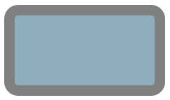
Property Description BorderThickness Sets how thick the border is. BorderBrush Sets the border color. BorderStyle Sets the border style. CornerRadius Sets the radius of the corners. Background Sets the control background. InitialBackground Sets the control background that is used before any dynamic Background value is assigned. Padding Sets the distance between the control edge and the Border content. ItemAlignment Sets the content horizontal alignment. Justification Sets the content vertical alignment. StackPanel

Property Description Padding Sets the distance between the control edge and the StackPanel items. Spacing Sets the distance between StackPanel items. ItemAlignment Sets the content alignment across the item distribution axis. Justification Sets the content alignment along the item distribution axis. Orientation Sets the item distribution axis orientation so items are ordered either vertically or horizontally. TablePanel
Allows to arrange controls into columns and rows as in the grid layout.
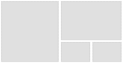
Property Description Gap Sets the distance between cells. ColumnDefinitions Defines the table columns using the grid-template-columns syntax. RowDefinitions Defines the table rows using the grid-template-rows syntax. Direct children of the TablePanel gain additional properties (attached properties) that modifies the child behavior within the panel:
Property Description Column Sets the column, the control is aligned into. Row Sets the row, the control is aligned into. ColSpan Sets the column count, the control occupies. RowSpan Sets the row count, the control occupies. TabControl
Allows to arrange single controls into separate pages that can be switched either programmatically through the SelectedPageId port, or manually by clicking the page header.

Property Description HideHeaders If set to true, the headers bar is hidden and pages can only be changed programmatically. SelectedPageId Gets or sets the index of the selected page. SelectedPage Gets the header text of the selected page. SelectedPageChanged Event raised when the page is changed. Previous: Designing WebHMI Next: Handling WebHMI Events


