
You are here: Start » Web HMI » Web HMI Controls » TextBlock
TextBlock
Displays a block of text with various styling options. The text can be bound to a program output or set statically.
Properties
| Color |
|
Defines the text color |
| FontFamily |
|
Defines the font family of the text. |
| FontWeight |
|
Defines the typography style of the text. |
| Height |
|
Defines the CSS height of the control. |
| InitialIsEnabled |
|
Defines the initial enabled state of the component that is used before the first value is set through the connection. |
| InitialIsVisible |
|
Defines the initial visibility of the component that is used before the first value is set through the connection. |
| InitialText |
|
Defines the initial text content displayed by the control. |
| IsEnabled |

|
Defines the enabled state of the component. |
| IsVisible |
|
Defines the visibility of the component. |
| Margin |
|
Defines the CSS margin of the control. |
| MaxHeight |
|
Defines the CSS max-height of the control. |
| MaxWidth |
|
Defines the CSS max-width of the control. |
| MinHeight |
|
Defines the CSS min-height of the control. |
| MinWidth |
|
Defines the CSS min-width of the control. |
| Name |
|
Defines the control name that identifies the control in the program and in the XAML. The name must be unique within the parent endpoint. |
| Overflow |
|
Defines the |
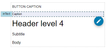
| Text |
|
Defines the text content displayed by the control. |
| TextOverflow |
|
Defines how the hidden content is handled. |
| Typography |
|
|
| WhiteSpace |
|
Defines how the |
| Width |
|
Defines the CSS width of the control. |