
You are here: Start » Web HMI » Web HMI Controls » CheckBox
CheckBox
Represents a checkbox control that allows users to select or deselect an option.
Properties
| Height |
|
Defines the CSS height of the control. |
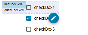
| InitialIsChecked |
|
Defines the initial checked state of the checkbox. |
| InitialIsEnabled |
|
Defines the initial enabled state of the component that is used before the first value is set through the connection. |
| InitialIsVisible |
|
Defines the initial visibility of the component that is used before the first value is set through the connection. |
| IsChecked |


|
Defines the checked state of the checkbox. |
| IsEnabled |
|
Defines the enabled state of the component. |
| IsVisible |
|
Defines the visibility of the component. |
| Margin |
|
Defines the CSS margin of the control. |
| MaxHeight |
|
Defines the CSS max-height of the control. |
| MaxWidth |
|
Defines the CSS max-width of the control. |
| MinHeight |
|
Defines the CSS min-height of the control. |
| MinWidth |
|
Defines the CSS min-width of the control. |
| Name |
|
Defines the control name that identifies the control in the program and in the XAML. The name must be unique within the parent endpoint. |
| Text |
|
Defines the text displayed next to the checkbox. |
| Width |
|
Defines the CSS width of the control. |
Events
| Click | Occurs when the checkbox is clicked. |
| Checked | Occurs when the checkbox is checked. |
| Unchecked | Occurs when the checkbox is unchecked. |