
You are here: Start » Web HMI » Web HMI Controls » Progress
Progress
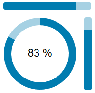
Represents a progress control that visually displays a value within a defined range.
Remarks
Supports customization of its appearance and behavior, including color ramp, thickness, background color, and text visibility. It can interpolate colors based on the value and supports different visual variants.
Properties
| Background |
|
Defines the background color of the progress control. |
| ColorRamp |

|
Represents a color ramp used to define the colors at specific positions. |
| Height |
|
Defines the CSS height of the control. |
| InitialIsEnabled |
|
Defines the initial enabled state of the component that is used before the first value is set through the connection. |
| InitialIsVisible |
|
Defines the initial visibility of the component that is used before the first value is set through the connection. |
| InterpolateColors |
|
Defines a value indicating whether colors should be interpolated. |
| IsEnabled |
|
Defines the enabled state of the component. |
| IsVisible |
|
Defines the visibility of the component. |
| Margin |
|
Defines the CSS margin of the control. |
| Name |
|
Defines the control name that identifies the control in the program and in the XAML. The name must be unique within the parent endpoint. |
| ShowText |
|
Defines a value indicating whether text should be displayed. |
| Thickness |
|
If in the Circular variant, defines the thickness of the progress control. |
| Value |
|
Defines the current value of the progress control. |
| Variant |
|
Defines the visual variant of the progress control. |
| Width |
|
Defines the CSS width of the control. |