
You are here: Start » Web HMI » Web HMI Controls » PieChart
PieChart
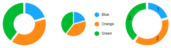
Control that represents a pie chart, displaying data as segments of a circle.
Properties
| ArcLabel |
|
Defines the type of label displayed on the arcs of the pie chart. |
| ArcLabelMinAngle |
|
Defines the minimum angle for displaying arc labels. |
| CenterLabel |

|
Defines the label displayed in the center of the pie chart. |
| Colors |
|
Defines the colors for each segment of the pie chart. |
| CornerRadius |
|
Defines the corner radius for the pie chart segments. |
| Data |
|
Defines the data for the pie chart. |
| EndAngle |
|
Defines the ending angle for the pie chart. |
| Height |
|
Defines the CSS height of the control. |
| HideLegend |
|
Defines whether the legend is hidden. |
| HideTooltip |
|
Defines whether tooltips are hidden. |
| InitialIsEnabled |
|
Defines the initial enabled state of the component that is used before the first value is set through the connection. |
| InitialIsVisible |
|
Defines the initial visibility of the component that is used before the first value is set through the connection. |
| InnerRadius |
|
Defines the inner radius for the pie chart, creating a donut chart effect if set. |
| IsEnabled |
|
Defines the enabled state of the component. |
| IsVisible |
|
Defines the visibility of the component. |
| Labels |
|
Defines the labels for each segment of the pie chart. |
| LegendDirection |
|
Defines the direction of the legend layout. |
| LegendHorizontalAlignment |
|
Defines the horizontal alignment of the legend. |
| LegendVerticalAlignment |
|
Defines the vertical alignment of the legend. |
| Margin |
|
Defines the CSS margin of the control. |
| Name |
|
Defines the control name that identifies the control in the program and in the XAML. The name must be unique within the parent endpoint. |
| PaddingAngle |
|
Defines the angle of padding between segments in the pie chart. |
| StartAngle |
|
Defines the starting angle for the pie chart. |
| Width |
|
Defines the CSS width of the control. |