You are here: Start » Web HMI » Web HMI Controls » Border
Border
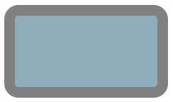
Represents a border control that can be used to visually separate content.

Properties
| Background |

|
Represents the CSS background-color attribute. Defines the background color of the control. |
| BorderBrush |
|
Represents the CSS border-color attribute. Defines the color of the control outline. |
| BorderStyle |
|
Represents the CSS border-style attribute. Defines the style of the control outline. |
| BorderThickness |
|
Represents the CSS border-width attribute. Defines the thickness of the control outline. |
| CornerRadius |
|
Represents the CSS border-radius attribute. Defines the radius of the border corners. |
| Height |
|
Defines the CSS height of the control. |
| InitialBackground |
|
Defines the initial background color used before the first value is set through the connection. |
| InitialIsEnabled |
|
Defines the initial enabled state of the component that is used before the first value is set through the connection. |
| InitialIsVisible |
|
Defines the initial visibility of the component that is used before the first value is set through the connection. |
| IsEnabled |

|
Defines the enabled state of the component. |
| IsVisible |

|
Defines the visibility of the component. |
| ItemAlignment |
|
Represents the CSS align-items attribute. Controls the horizontal alignment of items within the border. |
| Justification |
|
Represents the CSS justify-content attribute. Controls the vertical alignment of items within the border. |
| Margin |
|
Defines the CSS margin of the control. |
| Name |
|
Defines the control name that identifies the control in the program and in the XAML. The name must be unique within the parent endpoint. |
| Overflow |
|
Represents the CSS overflow attribute. Defines the behavior of content that does not fit in the border padding box. |
| Padding |
|
Represents the CSS padding attribute. Defines the padding of the control. |
| Width |
|
Defines the CSS width of the control. |

