
You are here: Start » Web HMI » Web HMI Controls » TextBox
TextBox
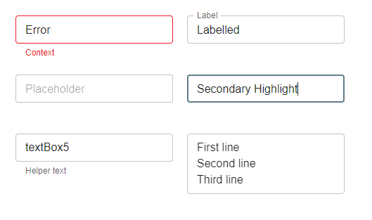
Represents a text input control that allows users to enter and edit text.
Properties
| FontFamily |
|
Defines the font family used for the text in the TextBox. |
| FontWeight |
|
Defines the font weight of the text in the TextBox. |
| Height |
|
Defines the CSS height of the control. |
| HelperText |

|
Defines the helper text displayed below the TextBox. |
| HideCharacters |
|
Defines whether the TextBox hides characters (e.g., for password input). |
| HighlightColor |
|
Defines the color used to highlight the TextBox. |
| InitialIsEnabled |
|
Defines the initial enabled state of the component that is used before the first value is set through the connection. |
| InitialIsValid |
|
Defines the initial validity state of the TextBox. |
| InitialIsVisible |
|
Defines the initial visibility of the component that is used before the first value is set through the connection. |
| InitialReadonly |
|
Defines the initial read-only state of the TextBox. |
| InitialText |
|
Defines the initial text displayed in the TextBox. |
| IsEnabled |
|
Defines the enabled state of the component. |
| IsValid |
|
Defines whether the TextBox is valid. |
| IsVisible |
|
Defines the visibility of the component. |
| Label |
|
Defines the label displayed above the TextBox. |
| Margin |
|
Defines the CSS margin of the control. |
| MaxHeight |
|
Defines the CSS max-height of the control. |
| MaxRows |
|
Defines the maximum number of rows for multiline TextBox. |
| MaxWidth |
|
Defines the CSS max-width of the control. |
| MinHeight |
|
Defines the CSS min-height of the control. |
| MinRows |
|
Defines the minimum number of rows for multiline TextBox. |
| MinWidth |
|
Defines the CSS min-width of the control. |
| Multiline |
|
Defines whether the TextBox supports multiline input. |
| Name |
|
Defines the control name that identifies the control in the program and in the XAML. The name must be unique within the parent endpoint. |
| Placeholder |
|
Defines the placeholder text displayed when the TextBox is empty. |
| Readonly |
|
Defines whether the TextBox is read-only. |
| Rows |
|
Defines the number of rows for multiline TextBox. |
| Text |

|
Defines the text displayed in the TextBox. |
| Variant |
|
Defines the visual style of the TextBox. |
| Width |
|
Defines the CSS width of the control. |
Events
| TextChanged | Occurs when the text in the TextBox is changed. |