
You are here: Start » HMI » Standard HMI Controls
Standard HMI Controls
Introduction
There are several groups of UI components in the HMI Controls catalog:
- Components – with non-visual elements which extend the HMI window functionality.
- Containers – for organizing the layout with panels, groups, splitters and tab controls.
- Controls – with standard controls for setting parameters and controlling the application state.
- File System – for choosing files and directories.
- Indicators – for displaying inspection results or status.
- Multiple Pages – for creating multi-screen applications.
- Password Protection – for limiting access to some parts of an HMI to authorized personnel.
- Shape Editors – with controls that allow the end user to define object models or measurement primitives.
- Shape Array Editors – with controls that allow the end user to define an array of object models or measurement primitives.
- State Management – for loading and saving state of the controls to a file.
- Video Box ‐ with several variants of the VideoBox control for high-performance image display.
In a basic machine vision application you will need one VideoBox control for displaying an image, possibly with some graphical overlays, and a couple of TrackBars, CheckBoxes, TextBoxes etc. for setting parameters. You will also often use Panels, GroupBoxes, Labels and ImageBoxes to organize and decorate the window space.
Common Properties
Many properties are the same for different standard controls. Here is a summary of the most important ones:
- AutoSize – specifies whether a control will automatically size itself to fit its contents.
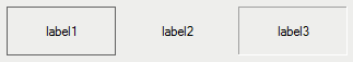
- BackColor – the background color of the component.

Three sample labels with different background colors.
- BackgroundImage – the background image used for the control.
- BorderStyle – controls how the border of the control looks like.
Three sample labels with different border styles.
- Enabled – can be used to make the control not editable by the end user.
Sample buttons, first enabled, second disabled.
- Font – defines the size and style of the font used to display text in the control.

Three sample labels with different fonts.
- ForeColor – foreground color of the control, which is used to display text.
- Text – a string being displayed in the control.
- Visible – can be used to make the control invisible (hide it).
With the available properties it is possible to create an application with virtually any look and feel. For example, to use an arbitrary design for a button, we can use a bitmap, while setting FlatAppearance.BorderSize = 0 and FlatStyle = Flat:

Sample custom style for a button and a label.
Note: Most properties of HMI controls can be also set dynamically during program execution, although only some of them are visible as ports when the control is selected. To expose additional ports, use the "Edit Port Visibility..." command from the control's context menu.
HMI Canvas
HMICanvas control represents the entire window of the created application. Other controls will be placed on it. Properties of HMICanvas define some global settings of the application, which are effective when it is run with Adaptive Vision Executor (runtime environment):
- ConsoleEnabled – specifies whether diagnostic console can be shown in the runtime application.
- ProgramControllerVisible – specifies whether Start / Pause / Stop buttons will be visible on the toolbar of Adaptive Vision Executor.
- ToolbarVisible – specifies whether the toolbar of Adaptive Vision Executor will be visible.
- WindowMode – specifies whether the application should be run in a fixed-size window, in a variable-size window or full-screen.
- WindowTitle – specifies the text displayed as the title of the runtime application.

Elements of the runtime application affected with properties of HMICanvas.
Remarks:
- If you are having trouble selecting the HMI Canvas because it is completely filled with other controls, right click on any control and choose the "Select: HMICanvas" command.
- Some parameters of HMI Canvas are automatically inherited by the contained controls. For example, if one changes the Font property, other controls will automatically have it set to the same value.
- Full-screen mode is especially useful, when it is required that the end user does not have access to elements of the underlying operating system. On Windows systems it is also possible to set Adaptive Vision Executor as the "system shell", thus removing Desktop, Menu Start etc. completely.
Controls for Setting Layout of the Window
Although it is possible to put all individual controls directly onto an HMI Canvas, it is recommended that related items are grouped together for both more convenient editing as well as for better end user's experience. Available controls in the "Containers" section are:
- GroupBox – can be used to group several controls within an enclosing frame with label.
- Panel – can be used to group several controls without additional graphical elements.
- SplitContainer – can be used to create two panels with movable boundary between them.
- TabControl – can be used to create multiple tabs in the user interface.
Other controls commonly used for making HMI look nice are: ImageBox (for displaying static images such as company logos) and Label (for any textual items).
However, when you would like to create more sophisticated HMI Panel with multiple screens go to The Multi Panel Control
See also: The TabControl Control.
Controls for Displaying Images
The "Video Box" section of the HMI Controls window contains several controls for high-performance display of image streams. These are:
- VideoBox – the basic variant of the image display control.
- SelectingVideoBox – also allows for selecting a box region by the end user.
- ZoomingVideoBox – also allows for zooming and panning the image by the end user.
- FloatingVideoWindow – a component that allows for opening an additional window for displaying images.
To display some additional information over images in a VideoBox it is necessary to modify the images using drawing filters before passing them to the VideoBox. This gives the user full control over the overlay design, but may expand the program. To keep the program simple, while still being able to display some overlay information, it is possible use View2DBox filters, which can be found in he "Indicators" section. They accept images and 2D primitives produced by various filters as input, however the provided control over the overlay style is limited:
- View2DBox – allows for overlaying 2D primitives (Point 2D, Circle 2D, Rectangle 2D etc.) over an image.
- View2DBox_PassFail – the color of the overlaying 2D primitives may change in accordance with a Bool type input.
Note: Do NOT use ImageBox control for displaying inspection results. It should only be used for static images.

A VideoBox.
Common properties:
- DisplayMode – switches between GDI and DirectX implementations. It depends on the underlying hardware, which one is faster.
- SizeMode – specifies how the image should be fitted to the available window space.
Controls for Setting Parameters
When some parameters of the application are to be set by the end user, the following controls can be used:
- TrackBar, Knob, NumericUpDown – for setting numerical values. You set Minimum and Maximum parameters and then the value actually selected by the end user will be available on the outValue output.
- CheckBox, ToggleButton, OnOffButton – for turning something on or off. The outValue or outChecked output will provide the state of the setting.
- ComboBox, RadioButton – for choosing one of several options.
- TextBox – for entering textual data. The entered text will be available on the outText output.
Example: Using TrackBar
TrackBar by default has two connectable inputs and one connectable output. The inValue input and the outValue output represent the same property – the value indicated by the current state of the control. The second input, inEnabled, is a boolean value and controls whether the track-bar is enabled or disabled in the user interface.

A track-bar.
Binding with a Label
Very often it is required that the current value of a TrackBar or a similar control is also visible in the HMI. This can be done with an additional Label control placed near the TrackBar, with the AutoValueSource property referring to the selected TrackBar.

Label showing an exact value of the TrackBar.
It is also possible to specify the format of the displayed text. The picture below shows a connected Label with the AutoValueFormat property set to "Tolerance: % [px]".

TrackBar with a connected Label using an additional text formatting.
Change Events
Controls that output some value adjustable by the user often also provide outputs informing about the moments when this value has been changed. For example, the ComboBox control has an output named outSelection (Integer) for indicating the index of the currently selected list item, but it also has outSelectionChanged (Bool) which is set to True for exactly one iteration when the selection has been changed.

Please note, that most of the "outSomethingChanged" outputs are hidden by default and can be shown with the "Edit Port Visibility..." command in the context menu of the control.
See also: Handling HMI Events.
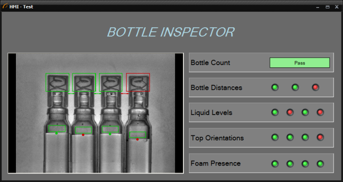
Controls for Displaying Inspection Results
Non-graphical inspection results are most often presented with the following controls:
- Label – for displaying simple text results.
- ListView, DetailedListView – for displaying arrays or tables.
- PassFailIndicator – for displaying text on a colorful background depending on the inspection status.
- BoolIndicatorBoard – for displaying inspection status where multiple objects or features are checked.
- AnalogIndicator, AnalogIndicatorWithScales – for displaying numerical results in a nice-looking graphical way.
Example use of one PassFailIndicator and several BoolIndicatorBoards.
AnalogIndicator
AnalogIndicator and its variant AnalogIndicatorWithScales are used to display numerical results in a retro style – as analog gauges. The latter variant can have green-orange-red ranges defined with properties like GreenColorMinimum, GreenColorMaximum etc. The ranges are usually disjoint, but there can also be nested ranges: e.g. the red color can span throughout the scale, and the green color can have a narrower range around the middle of the scale. The green sector will be displayed on top, producing an effect of a single green sector, with two red sectors outside.

Analog indicators with and without scales
Event Triggering Controls
Most of the standard controls in Adaptive Vision Studio fall into one of two categories: (1) data presenters and (2) parameter setters. There are, however, also some controls that can trigger events – most notably the ImpulseButton control.
The ImpulseButton control is an event triggering control, which has one output, outValue. The value returned is of the Bool type. As long the button is not clicked, it will return False. Once the button is clicked, the value becomes True for exactly one iteration of the program.

A simple use case of the ImpulseButton.
For more information about events see: Handling HMI Events.
The TabControl Control
TabControl is the one of the methods to organize HMI panels within a limited space of a form. It is a container with several "tabs", where each page contains a different set of controls.

TabControl.
The MultiPanelControl Control
MultiPanelControl is an easy and convenient way to organize bigger HMI panels. It employs a multi-screen approach to provide more space and enables adding special purpose windows like e.g. a "Configuration" page.

MultiPanelControl.
To create a multi-screen HMI, first place a MultiPanelControl control in your window and fit it to the window size.
In the upper-right corner of this control you will see a four element Navigation Bar
( ).
Using the left and right arrows you will be able to switch between consecutive screens. The frame button allows
for selecting the parent control in the same way as the “Select: MultiPanelControl” command in the control's context menu.
And the triple dot button opens a configuration windows as on the picture below:
).
Using the left and right arrows you will be able to switch between consecutive screens. The frame button allows
for selecting the parent control in the same way as the “Select: MultiPanelControl” command in the control's context menu.
And the triple dot button opens a configuration windows as on the picture below:

MultiPanelControl Property Box.
Also when you double-click on the area of a MultiPanelControl, the same configuration window appears. Using this window you are able to organize the pages. During work with pages there are at least two necessary things you have to remember. First – all pages names have to be unique globally. Second – one MultiPanelControl contains many MultiPanelPages. An important thing is the home icon – use it to set the Initial Page of your application. It will be the first page to appear when the program starts.A MultiPanelControl control is usually accompanied by some MultiPanelSwitchButton controls that navigate between the pages. Usage of a button of this kind is very simple. Just place it on your window and set the TargetPage property (also available through double-clicking on the button). Page switching buttons are usually placed within individual pages, but this is not strictly required – they can also be placed outside of the MultiPanelControl control.
Every HMI Control has built-in input and output ports. In MultiPanelControl, by default, two ports are visible: "inActivePageName" and "outActivePageName", but there are more. (To make them visible click the right mouse button on the control and select "Edit Ports Visibility..."). The "inActivePageName" input enables setting the active page directly from your program. It is another way to handle page changing. One is using the dedicated buttons by the operator and here comes another method. It might be useful e.g. when "something happens" and you would like to change the screen automatically, not by a button click. This can be e.g. information that a connection with remote host was lost and immediate reconfiguration is needed. The "outActivePageName" by definition is an output which allows you to check the current active page.
Note: More information is available as "HMI Multipanel Control" in the official examples of Adaptive Vision Studio.
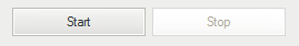
Program Control Buttons
Controlling the program execution process, i.e. starting, iterating and pausing, by the end user is possible with a set of ProgramControlButton controls, or with the complete panel named ProgramControlBox. These controls are available in the "Controls" section of the HMI Controls window.


A Start button with a custom text.

ProgramControlBox, similar to the controls from Adaptive Vision Studio.
Remarks:
- The Stop button is not available for the HMI, because the end user should not be able to stop the entire application at a random point of execution. If you have a good reason to make it possible, use a separate ImpulseButton control connected to an Exit filter.
- ProgramControlButton and ProgramControlBox controls are useful for the purpose of fast prototyping. In many applications, however, it might be advisable to design an application-specific state machine.
File and Directory Picking
There are two controls for selecting paths in the file system, which are FilePicker and DirectoryPicker. They look similar to a TextBox, but they have a button next to them, which brings up a standard system file dialog for browsing a file or directory.
What is worth mentioning about these two controls is the option NilOnEmpty, which can be useful for conditional execution. As the name suggests, it causes the control to return the special NIL value instead of an empty string, when no file or directory is chosen.
Shape Editors
Geometrical primitives, regions and fitting fields, that are used as parameters in image analysis algorithms, are usually created by the user of Adaptive Vision Studio. In some cases, however, it is also required that the end user is able to adjust these elements in the runtime environment. For that purpose, in the "Shape Editors" section available are appropriate controls that bring graphical editors known from Adaptive Vision Studio to the HMI Designer environment.
Each such editor has a form of a button with four ports visible by default:
- inAlignment – for specifying an appropriate coordinate system for the edited shape.
- inReferenceImage – for specifying a background images for the editor.
- inValue – for setting initial value of the edited shape.
- outValue – for getting the value of the shape after it is edited by the end user.
- outStoredReferenceImage – a reference image that was displayed in the editor during last editing approved with the OK button. Active when inStoreReferenceImage is set to True.
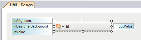
Sample ShapeRegion editor control in the HMI Designer.
When the end user clicks the button, an appropriate graphical editor is opened:

Sample ShapeRegion editor opened after the button is clicked in the runtime environment.
The following properties specific these controls allow for customizing appearance of an opened editor:
- HideSelectors – allows to simplify the editor by removing image and coordinate system selectors.
- Message – an additional text that can be displayed in an opened editor as a hint for the user.
- WindowTitle – text displayed on the title bar of the opened editor's window.
The reference image is copied to HMI control in each macrofilter iteration. To achieve best performance separate vision algorithm from preparation of algorithm data.
ProfileBox
ProfileBox is an HMI control that displays a profile of evenly sampled measurements. ProfileBox is available in the "Indicators" section of the HMI Controls window.
ProfileBox may be useful for displaying array of samples of a known length, for example a profile of an image column or a laser line.

Profile of a laser line.
Also it is used for displaying dynamic data from sensors outputs in the function of time.

Temperature chart.
There are several specific properties for this control:
- DomainDefaultLength, DomainDefaultSizeMode, DomainScale and DomainStart – set of parameters responsible for appearance and behavior of the X axis.
- EnableManualZoomChange – for specifying whether the end user is able to zoom the chart area.
- ChartColor, GridColor, BackColor, AxisColor – for specifying the colors of a ProfileBox content.
- HighQualityMode – for specifying whether the chart is drawn with high quality or with low quality, but faster.
- HorizontalAxisName, VerticalAxisName – for specifying the names of axes.
- HorizontalAxisMin, HorizontalAxisMax, VerticalAxisMin, VerticalAxisMax – for setting the limits of the chart axes.
| Previous: Designing HMI | Next: Handling HMI Events |